Musadgn adlı üyeden alıntı:
mesajı görüntüle
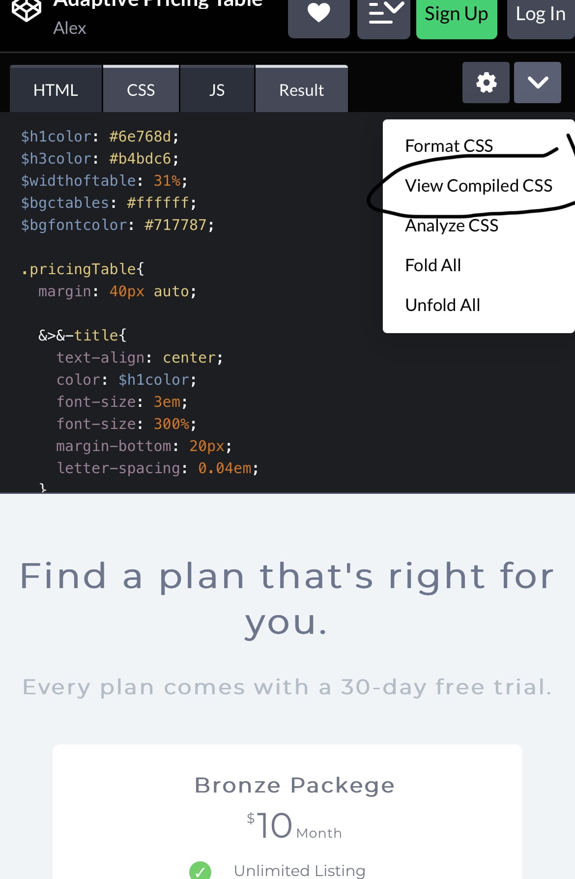
<div class="pricingTable">
<h2 class="pricingTable-title">Find a plan that's right for you.</h2>
<h3 class="pricingTable-subtitle">Every plan comes with a 30-day free trial.</h3>
<ul class="pricingTable-firstTable">
<li class="pricingTable-firstTable_table">
<h1 class="pricingTable-firstTable_table__header">Bronze Packege</h1>
<p class="pricingTable-firstTable_table__pricing"><span>$</span><span>10</span><span>Month</span></p>
<ul class="pricingTable-firstTable_table__options">
<li>Unlimited Listing</li>
<li>Edit Your Listing</li>
<li>Approve Reviews</li>
</ul>
<button class="pricingTable-firstTable_table__getstart">Get Started Now</button>
</li><li class="pricingTable-firstTable_table">
<h1 class="pricingTable-firstTable_table__header">Gold Packege</h1>
<p class="pricingTable-firstTable_table__pricing"><span>$</span><span>19</span><span>Month</span></p>
<ul class="pricingTable-firstTable_table__options">
<li>Unlimited Listing</li>
<li>Edit Your Listing</li>
<li>Approve Reviews</li>
<li>Take Booking Online</li>
<li>24/7 Support Service</li>
</ul>
<button class="pricingTable-firstTable_table__getstart">Get Started Now</button>
</li><li class="pricingTable-firstTable_table">
<h1 class="pricingTable-firstTable_table__header">Platinum Packege</h1>
<p class="pricingTable-firstTable_table__pricing"><span>$</span><span>49</span><span>Month</span></p>
<ul class="pricingTable-firstTable_table__options">
<li>Unlimited Listing</li>
<li>Edit Your Listing</li>
<li>Approve Reviews</li>
</ul>
<button class="pricingTable-firstTable_table__getstart">Get Started Now</button>
</li>
</ul>
</div>
<style>
@charset "UTF-8";
.pricingTable {
margin: 40px auto;
}
.pricingTable > .pricingTable-title {
text-align: center;
color: #6e768d;
font-size: 3em;
font-size: 300%;
margin-bottom: 20px;
letter-spacing: 0.04em;
}
.pricingTable > .pricingTable-subtitle {
text-align: center;
color: #b4bdc6;
font-size: 1.8em;
letter-spacing: 0.04em;
margin-bottom: 60px;
}
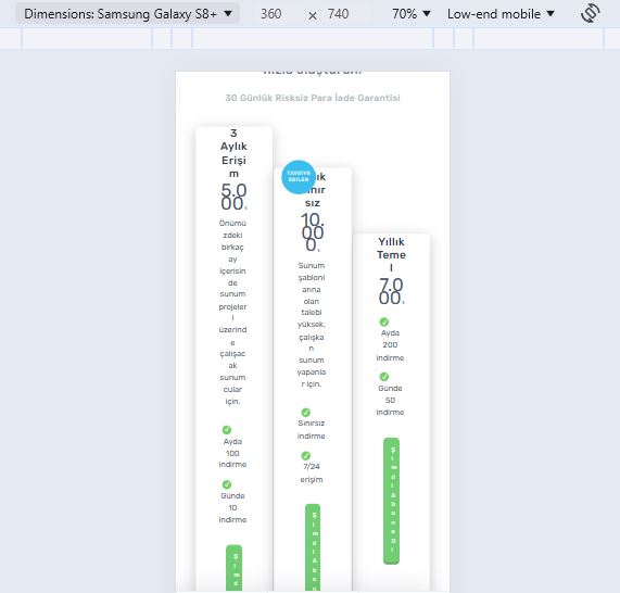
@media screen and (max-width: 480px) {
.pricingTable > .pricingTable-subtitle {
margin-bottom: 30px;
}
}
.pricingTable-firstTable {
list-style: none;
padding-left: 2em;
padding-right: 2em;
text-align: center;
}
.pricingTable-firstTable_table {
vertical-align: middle;
width: 31%;
background-color: #ffffff;
display: inline-block;
padding: 0px 30px 40px;
text-align: center;
max-width: 320px;
transition: all 0.3s ease;
border-radius: 5px;
}
@media screen and (max-width: 767px) {
.pricingTable-firstTable_table {
display: block;
width: 90%;
margin: 0 auto;
max-width: 90%;
margin-bottom: 20px;
padding: 10px;
padding-left: 20px;
}
}
@media screen and (max-width: 767px) {
.pricingTable-firstTable_table > * {
display: inline-block;
vertical-align: middle;
}
}
@media screen and (max-width: 480px) {
.pricingTable-firstTable_table > * {
display: block;
float: none;
}
}
@media screen and (max-width: 767px) {
.pricingTable-firstTable_table:after {
display: table;
content: "";
clear: both;
}
}
.pricingTable-firstTable_table:hover {
transform: scale(1.08);
}
@media screen and (max-width: 767px) {
.pricingTable-firstTable_table:hover {
transform: none;
}
}
.pricingTable-firstTable_table:not(:last-of-type) {
margin-right: 3.5%;
}
@media screen and (max-width: 767px) {
.pricingTable-firstTable_table:not(:last-of-type) {
margin-right: auto;
}
}
.pricingTable-firstTable_table:nth-of-type(2) {
position: relative;
}
@media screen and (max-width: 767px) {
.pricingTable-firstTable_table:nth-of-type(2) h1 {
padding-top: 8%;
}
}
.pricingTable-firstTable_table:nth-of-type(2):before {
content: "Most Popular";
position: absolute;
color: white;
display: block;
background-color: #3bbdee;
text-align: center;
right: 15px;
top: -25px;
height: 65px;
width: 65px;
border-radius: 50%;
box-sizing: border-box;
font-size: 0.5em;
padding-top: 22px;
text-transform: uppercase;
letter-spacing: 0.13em;
transition: all 0.5s ease;
}
@media screen and (max-width: 988px) {
.pricingTable-firstTable_table:nth-of-type(2):before {
font-size: 0.6em;
}
}
@media screen and (max-width: 767px) {
.pricingTable-firstTable_table:nth-of-type(2):before {
left: 10px;
width: 45px;
height: 45px;
top: -10px;
padding-top: 13px;
}
}
@media screen and (max-width: 480px) {
.pricingTable-firstTable_table:nth-of-type(2):before {
font-size: 0.8em;
}
}
.pricingTable-firstTable_table:nth-of-type(2):hover:before {
transform: rotate(360deg);
}
.pricingTable-firstTable_table__header {
font-size: 1.6em;
padding: 40px 0px;
border-bottom: 2px solid #ebedec;
letter-spacing: 0.03em;
}
@media screen and (max-width: 1068px) {
.pricingTable-firstTable_table__header {
font-size: 1.45em;
}
}
@media screen and (max-width: 767px) {
.pricingTable-firstTable_table__header {
padding: 0px;
border-bottom: none;
float: left;
width: 33%;
padding-top: 3%;
padding-bottom: 2%;
}
}
@media screen and (max-width: 610px) {
.pricingTable-firstTable_table__header {
font-size: 1.3em;
}
}
@media screen and (max-width: 480px) {
.pricingTable-firstTable_table__header {
float: none;
width: 100%;
font-size: 1.8em;
margin-bottom: 5px;
}
}
.pricingTable-firstTable_table__pricing {
font-size: 3em;
padding: 30px 0px;
border-bottom: 2px solid #ebedec;
line-height: 0.7;
}
@media screen and (max-width: 1068px) {
.pricingTable-firstTable_table__pricing {
font-size: 2.8em;
}
}
@media screen and (max-width: 767px) {
.pricingTable-firstTable_table__pricing {
border-bottom: none;
padding: 0;
float: left;
clear: left;
width: 33%;
}
}
@media screen and (max-width: 610px) {
.pricingTable-firstTable_table__pricing {
font-size: 2.4em;
}
}
@media screen and (max-width: 480px) {
.pricingTable-firstTable_table__pricing {
float: none;
width: 100%;
font-size: 3em;
margin-bottom: 10px;
}
}
.pricingTable-firstTable_table__pricing span:first-of-type {
font-size: 0.35em;
vertical-align: top;
letter-spacing: 0.15em;
}
@media screen and (max-width: 1068px) {
.pricingTable-firstTable_table__pricing span:first-of-type {
font-size: 0.3em;
}
}
.pricingTable-firstTable_table__pricing span:last-of-type {
vertical-align: bottom;
font-size: 0.3em;
letter-spacing: 0.04em;
padding-left: 0.2em;
}
@media screen and (max-width: 1068px) {
.pricingTable-firstTable_table__pricing span:last-of-type {
font-size: 0.25em;
}
}
.pricingTable-firstTable_table__options {
list-style: none;
padding: 15px;
font-size: 0.9em;
border-bottom: 2px solid #ebedec;
}
@media screen and (max-width: 1068px) {
.pricingTable-firstTable_table__options {
font-size: 0.85em;
}
}
@media screen and (max-width: 767px) {
.pricingTable-firstTable_table__options {
border-bottom: none;
padding: 0;
margin-right: 10%;
}
}
@media screen and (max-width: 610px) {
.pricingTable-firstTable_table__options {
font-size: 0.7em;
margin-right: 8%;
}
}
@media screen and (max-width: 480px) {
.pricingTable-firstTable_table__options {
font-size: 1.3em;
margin-right: none;
margin-bottom: 10px;
}
}
.pricingTable-firstTable_table__options > li {
padding: 8px 0px;
}
@media screen and (max-width: 767px) {
.pricingTable-firstTable_table__options > li {
text-align: left;
}
}
@media screen and (max-width: 610px) {
.pricingTable-firstTable_table__options > li {
padding: 5px 0;
}
}
@media screen and (max-width: 480px) {
.pricingTable-firstTable_table__options > li {
text-align: center;
}
}
.pricingTable-firstTable_table__options > li:before {
content: "✓";
display: inline-flex;
margin-right: 15px;
color: white;
background-color: #74ce6a;
border-radius: 50%;
width: 15px;
height: 15px;
font-size: 0.8em;
padding: 2px;
align-items: center;
justify-content: center;
}
@media screen and (max-width: 1068px) {
.pricingTable-firstTable_table__options > li:before {
width: 14px;
height: 14px;
padding: 1.5px;
}
}
@media screen and (max-width: 767px) {
.pricingTable-firstTable_table__options > li:before {
width: 12px;
height: 12px;
}
}
.pricingTable-firstTable_table__getstart {
color: white;
border: 0;
background-color: #71ce73;
margin-top: 30px;
border-radius: 5px;
cursor: pointer;
padding: 15px;
box-shadow: 0px 3px 0px 0px #66ac64;
letter-spacing: 0.07em;
transition: all 0.4s ease;
}
@media screen and (max-width: 1068px) {
.pricingTable-firstTable_table__getstart {
font-size: 0.95em;
}
}
@media screen and (max-width: 767px) {
.pricingTable-firstTable_table__getstart {
margin-top: 0;
}
}
@media screen and (max-width: 610px) {
.pricingTable-firstTable_table__getstart {
font-size: 0.9em;
padding: 10px;
}
}
@media screen and (max-width: 480px) {
.pricingTable-firstTable_table__getstart {
font-size: 1em;
width: 50%;
margin: 10px auto;
}
}
.pricingTable-firstTable_table__getstart:hover {
transform: translateY(-10px);
box-shadow: 0px 40px 29px -19px rgba(102, 172, 100, 0.9);
}
@media screen and (max-width: 767px) {
.pricingTable-firstTable_table__getstart:hover {
transform: none;
box-shadow: none;
}
}
.pricingTable-firstTable_table__getstart:active {
box-shadow: inset 0 0 10px 1px #66a564, 0px 40px 29px -19px rgba(102, 172, 100, 0.95);
transform: scale(0.95) translateY(-9px);
}
@media screen and (max-width: 767px) {
.pricingTable-firstTable_table__getstart:active {
transform: scale(0.95) translateY(0);
box-shadow: none;
}
}
body {
font-family: "Montserrat", sans-serif;
font-size: 100%;
background-color: #f0f4f7;
color: #717787;
}
@media screen and (max-width: 960px) {
body {
font-size: 80%;
}
}
@media screen and (max-width: 776px) {
body {
font-size: 70%;
}
}
@media screen and (max-width: 496px) {
body {
font-size: 50%;
}
}
@media screen and (max-width: 320px) {
body {
font-size: 40%;
}
}
* {
padding: 0;
margin: 0;
box-sizing: border-box;
}
</style>