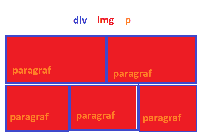
Mavi renk: div
Kırmızı renk: img
Turuncu renk: p
Sorun: div'lerin içinde img var ve bu resimlerin üzerine yazı yazmak istiyorum. Ama bootstrap kullanıyorum, yani responsive olmalı.
3
●663

<!doctype html>
<html lang="tr">
<head>
    <title>LOREM İPSUM</title>
    <meta charset="utf-8">
    <meta name="viewport" content="width=device-width, initial-scale=1.0">
    <meta name="keywords" content="LOREM İPSUM">
    <meta name="description" content="LOREM İPSUM">
    <style>
        /* body ve container kalkabilir */
        body {
            padding:0;
            margin:0;
        }
        .container {
            width:960px;
            margin:0 auto;
            position:relative;
        }
        /* body ve container kalkabilir */

        .spe-bars * {
            box-sizing: border-box;
            -moz-box-sizing: border-box;
            -webkit-box-sizing: border-box;
        }
        .spe-bars::after {
            content:"";
            display:block;
            clear:both;
        }
        .spe-b-col {
            position:relative;
            display:block;
            float:left;
            margin-bottom:1%;
        }
        .spe-b-img {
            position:relative;
        }
        .spe-b-img img {
            height:300px;
            width:100%;
            display:block;
        }
        .spe-b-par {
            padding:20px;
            position:absolute;
            z-index:2;
            bottom:0;
        }
        .spe-b-par p {
            padding:0;
            margin:0;
            color:#fff;
            font-size:20px;
        }
        /* aşağıdaki bölüm sağa ve sola yaslama ve aynı zamanda genişlik değerlerini belirleme bölümü, eğer daha fazla eleman eklenecekse bu alanı çoğaltarak nth-child ile 5'den sonraki elemanları yakalayıp ayarlayabilirsiniz. */
        .spe-bars .spe-b-col:nth-child(1) {
            width:49.5%;
            float:left;
        }
        .spe-bars .spe-b-col:nth-child(2) {
            width:49.5%;
            float:right;
        }
        .spe-bars .spe-b-col:nth-child(3) {
            width:32.6%;
            float:left;
            margin-right:1%;
        }
        .spe-bars .spe-b-col:nth-child(4) {
            width:32.6%;
            float:left;
        }
        .spe-bars .spe-b-col:nth-child(5) {
            width:32.6%;
            float:right;
        }

    </style>
</head>
<body>

<div class="container"> <!-- container kullanmana gerek yok -->

    <div class="spe-bars">
        <div class="spe-b-col">
            <div class="spe-b-img">
                <div class="spe-b-par">
                    <p>Lorem İpsum Dolor Sit Amet</p>
                </div>
                <img src="https://www.gannett-cdn.com/presto/2018/08/06/USAT/d7e9198a-b2fa-4ca6-b947-31c3751cc248-GettyImages-898660948.jpg?width=534&height=401&fit=bounds&auto=webp" alt="">
            </div>
        </div>
    </div>

</div> <!-- container -->


</body>
</html> 
