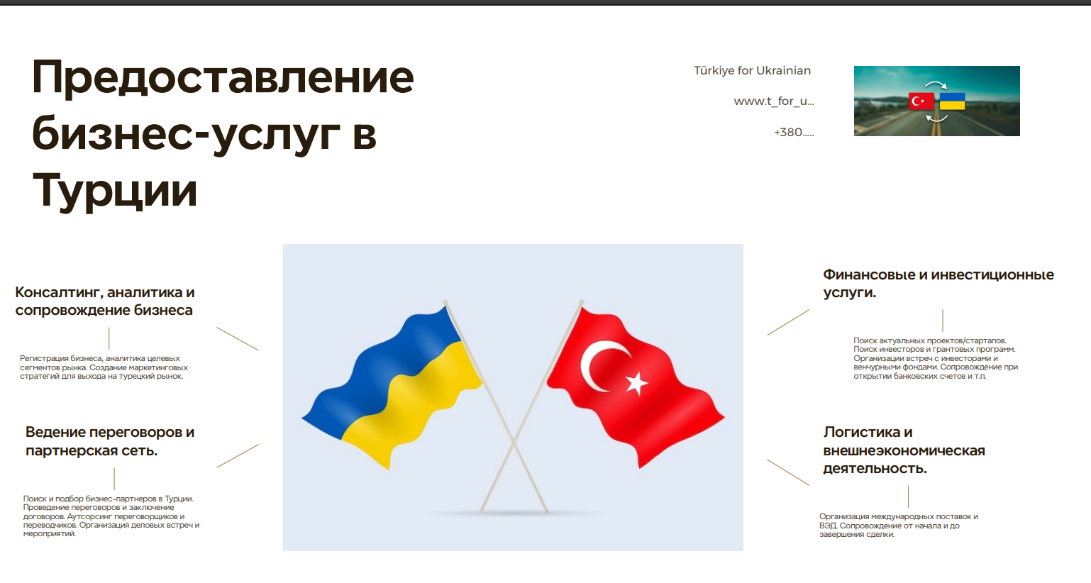
merhaba dostlar bu resimden wordpress sayfa oluşturmam lazım aynısını html kod olarak eklemeyi planladım hayrına kodu yazabilecek var mı yazı ve resimler de birebir aynı olacak
yardımlarınızı bekliyorum teşekkürler
6
●204

<!DOCTYPE html>
<html lang="ru">
<head>
<meta charset="UTF-8">
<meta name="viewport" content="width=device-width, initial-scale=1.0">
<title>Бизнес-услуги в Турции для Украинцев</title>
<link rel="stylesheet" href="style.css">
</head>
<style type="text/css">
body {
font-family: Arial, Helvetica, sans-serif; /* Using a common font */
margin: 0;
padding: 0;
background-color: #fff;
color: #333; /* Dark grey for text */
line-height: 1.6;
}

.site-header {
display: flex;
justify-content: space-between;
align-items: flex-start; /* Align items to the top */
padding: 20px 50px;
margin-bottom: 30px;
}

.main-title h1 {
font-size: 3.5em; /* Large font size for main title */
color: #402F1D; /* Dark brown color like the image */
margin: 0;
line-height: 1.1; /* Adjust line height for multi-line title */
font-weight: bold;
}

.contact-info {
text-align: right;
font-size: 0.9em;
color: #555;
}

.contact-info p {
margin: 5px 0;
}

.contact-info .header-flag {
width: 40px; /* Small flags */
height: auto;
margin-left: 5px;
vertical-align: middle; /* Align flags nicely with text */
}


.main-content {
display: flex;
justify-content: space-between; /* Pushes columns apart */
align-items: flex-start; /* Align content blocks to the top */
padding: 0 50px;
gap: 30px; /* Space between columns */
}

.column {
flex: 1; /* Basic flex sizing, adjust as needed */
max-width: 30%; /* Limit column width */
}

.column-center {
flex: 1.2; /* Give center column a bit more space if needed */
text-align: center; /* Center the flags */
background-color: #f0f4f8; /* Light grey/blue background for center */
padding: 20px;
border-radius: 8px; /* Optional rounded corners */
display: flex; /* Use flex to place flags side-by-side or manage layout */
justify-content: center;
align-items: center;
gap: 10px; /* Space between the two flags */
}

.column-center .flag-large {
max-width: 45%; /* Adjust size as needed, keeping aspect ratio */
height: auto;
display: inline-block; /* Keep them inline */
}


.service-block {
margin-bottom: 40px; /* Space between service blocks */
}

.service-block h3 {
font-size: 1.4em;
color: #402F1D; /* Dark brown color like the image */
margin-bottom: 10px;
font-weight: bold;
}

.service-block p {
font-size: 0.9em;
color: #444; /* Slightly lighter text for descriptions */
}

/* Responsive adjustments (optional basic example) */
@media (max-width: 768px) {
.site-header {
flex-direction: column;
align-items: center;
text-align: center;
}
.contact-info {
text-align: center;
margin-top: 15px;
}
.main-content {
flex-direction: column;
align-items: center; /* Center columns when stacked */
padding: 0 20px;
}
.column {
max-width: 90%; /* Allow columns to take more width */
margin-bottom: 30px;
}
.column-center {
order: -1; /* Move flags to the top on small screens if desired */
}
}
</style>
<body>

<header class="site-header">
<div class="main-title">
<h1>Предоставление<br>бизнес-услуг в<br>Турции</h1>
</div>
<div class="contact-info">
<p>Türkiye for Ukrainian</p>
<p>www.t_for_u...</p>
<p>+380....</p>
<!-- Placeholder image representing Turkey-Ukraine connection -->
<img src="https://upload.wikimedia.org/wikipedia/commons/thumb/8/8e/Flag_of_Turkey.svg/100px-Flag_of_Turkey.svg.png" alt="Turkish Flag" class="header-flag">
<img src="https://upload.wikimedia.org/wikipedia/commons/thumb/4/49/Flag_of_Ukraine.svg/100px-Flag_of_Ukraine.svg.png" alt="Ukrainian Flag" class="header-flag">

</div>
</header>

<main class="main-content">
<section class="column column-left">
<div class="service-block">
<h3>Консалтинг, аналитика и сопровождение бизнеса</h3>
<p>Регистрация бизнеса, аналитика целевых сегментов рынка. Создание маркетинговых стратегий для выхода на турецкий рынок.</p>
</div>
<div class="service-block">
<h3>Ведение переговоров и партнерская сеть</h3>
<p>Поиск и подбор бизнес-партнеров в Турции. Проведение переговоров и заключение договоров. Аутсорсинг переговорщиков и переводчиков. Организация деловых встреч и мероприятий.</p>
</div>
</section>

<section class="column column-center">
<!-- Placeholder image of crossed flags -->
<img src="https://upload.wikimedia.org/wikipedia/commons/thumb/a/a4/Flag_of_Turkey.svg/320px-Flag_of_Turkey.svg.png" alt="Turkish Flag Waving" class="flag-large">
<img src="https://upload.wikimedia.org/wikipedia/commons/thumb/4/49/Flag_of_Ukraine.svg/320px-Flag_of_Ukraine.svg.png" alt="Ukrainian Flag Waving" class="flag-large">
</section>

<section class="column column-right">
<div class="service-block">
<h3>Финансовые и инвестиционные услуги</h3>
<p>Поиск актуальных проектов/стартапов. Поиск инвесторов и грантовых программ. Организации встреч с инвесторами и венчурными фондами. Сопровождение при открытии банковских счетов и т.п.</p>
</div>
<div class="service-block">
<h3>Логистика и внешнеэкономическая деятельность</h3>
<p>Организация международных поставок и ВЭД. Сопровождение от начала и до завершения сделки.</p>
</div>
</section>
</main>

</body>
</html> <!DOCTYPE html>
<html lang="ru">
<head>
<meta charset="UTF-8">
<meta name="viewport" content="width=device-width, initial-scale=1.0">
<title>Бизнес-услуги в Турции</title>
<style>
* {
margin: 0;
padding: 0;
box-sizing: border-box;
}
body {
font-family: 'Roboto', Arial, sans-serif;
background-color: #ffffff;
color: #333;
padding: 20px;
line-height: 1.4;
}
.container {
max-width: 1200px;
margin: 0 auto;
padding: 20px;
}
header {
display: flex;
justify-content: space-between;
align-items: flex-start;
margin-bottom: 70px;
}
.title h1 {
font-size: 52px;
font-weight: 700;
color: #30220f;
max-width: 520px;
line-height: 1.15;
}
.contact-info {
text-align: right;
padding-top: 10px;
}
.contact-info h3 {
color: #8b542f;
font-size: 24px;
margin-bottom: 8px;
font-weight: 600;
}
.contact-info p {
color: #666;
margin-bottom: 8px;
}
.flag-icon img {
margin-top: 10px;
border-radius: 8px;
width: 200px;
height: auto;
object-fit: cover;
}
.services-container {
display: grid;
grid-template-columns: 1fr auto 1fr;
grid-template-rows: 1fr 1fr;
gap: 50px 40px;
position: relative;
margin-top: 20px;
}
.center-image {
grid-column: 2;
grid-row: 1 / span 2;
align-self: center;
justify-self: center;
z-index: 1;
}
.center-image img {
max-width: 100%;
display: block;
border-radius: 5px;
box-shadow: 0 3px 6px rgba(0,0,0,0.1);
}
.service {
position: relative;
padding-bottom: 20px;
}
.service h3 {
position: relative;
display: inline-block;
margin-bottom: 15px;
font-size: 20px;
font-weight: 700;
color: #333;
line-height: 1.3;
}
.service p {
font-size: 13px;
color: #666;
line-height: 1.5;
}
/* Position services */
.left-top {
grid-column: 1;
grid-row: 1;
text-align: right;
padding-right: 60px;
position: relative;
align-self: center;
}
.left-bottom {
grid-column: 1;
grid-row: 2;
text-align: right;
padding-right: 60px;
position: relative;
align-self: center;
}
.right-top {
grid-column: 3;
grid-row: 1;
text-align: left;
padding-left: 60px;
position: relative;
align-self: center;
}
.right-bottom {
grid-column: 3;
grid-row: 2;
text-align: left;
padding-left: 60px;
position: relative;
align-self: center;
}
/* Additional styling to match the design */
.left-top h3, .left-bottom h3 {
padding-right: 20px;
}
.right-top h3, .right-bottom h3 {
padding-left: 20px;
}
/* Add connecting lines */
.service::after {
content: '';
position: absolute;
height: 1px;
background-color: #bbb;
top: 22px;
}
.left-top::after {
right: 0;
width: 75px;
transform: rotate(5deg);
}
.left-bottom::after {
right: 0;
width: 75px;
transform: rotate(-5deg);
}
.right-top::after {
left: 0;
width: 75px;
transform: rotate(-5deg);
}
.right-bottom::after {
left: 0;
width: 75px;
transform: rotate(5deg);
}
@media (max-width: 950px) {
.services-container {
grid-template-columns: 1fr;
grid-template-rows: auto auto auto auto auto;
}
.center-image {
grid-column: 1;
grid-row: 3;
margin: 40px 0;
}
.left-top, .left-bottom, .right-top, .right-bottom {
grid-column: 1;
text-align: center;
padding: 0;
}
.left-top { grid-row: 1; }
.left-bottom { grid-row: 2; }
.right-top { grid-row: 4; }
.right-bottom { grid-row: 5; }
.service::after {
display: none;
}
.title h1 {
font-size: 36px;
}
header {
flex-direction: column;
align-items: center;
}
.contact-info {
text-align: center;
margin-top: 20px;
}
}
</style>
<link href="https://fonts.googleapis.com/css2?family=Roboto:wght@400;500;700&display=swap" rel="stylesheet">
</head>
<body>
<div class="container">
<header>
<div class="title">
<h1>Предоставление бизнес-услуг в Турции</h1>
</div>
<div class="contact-info">
<h3>Türkiye for Ukrainian</h3>
<p>www.t_for_u...</p>
<p>+380....</p>
<div class="flag-icon">
<img src="https://i.ibb.co/r6VF5Dh/turkey-ukraine-road.jpg" alt="Turkey-Ukraine Flags">
</div>
</div>
</header>
<main>
<div class="services-container">
<div class="service left-top">
<h3>Консалтинг, аналитика и сопровождение бизнеса</h3>
<p>Регистрация бизнеса, аналитика целевых сегментов рынка. Создание маркетинговых стратегий для выхода на турецкий рынок.</p>
</div>
<div class="service left-bottom">
<h3>Ведение переговоров и партнерская сеть.</h3>
<p>Поиск и подбор бизнес-партнеров в Турции. Проведение переговоров и заключение договоров. Аутсорсинг переговорщиков и переводчиков. Организация деловых встреч и мероприятий.</p>
</div>
<div class="center-image">
<img src="https://i.ibb.co/TvYhKjY/turkey-ukraine-flags.jpg" alt="Turkey and Ukraine Flags">
</div>
<div class="service right-top">
<h3>Финансовые и инвестиционные услуги.</h3>
<p>Поиск актуальных проектов/стартапов. Поиск инвесторов и грантовых программ. Организации встреч с инвесторами и венчурными фондами. Сопровождение при открытии банковских счетов и т.д.</p>
</div>
<div class="service right-bottom">
<h3>Логистика и внешнеэкономическая деятельность.</h3>
<p>Организация международных поставок и ВЭД. Сопровождение от начала и до завершения сделки.</p>
</div>
</div>
</main>
</div>
</body>
</html>