Style css olan kodda problem var,çalışmıyor.
Koda bakabilirsiniz. https://codepen.io/zitrusfrisch/pen/DbwjOR buradan da bakabilirsiniz.
body {
font: 400 1em/1.5 "Neuton";
background: #090d00;
color: rgba(255, 255, 255, 0.25);
text-align: center;
margin: 0;
}
p {
text-transform: uppercase;
letter-spacing: 0.5em;
display: inline-block;
border: 4px double rgba(255, 255, 255, 0.25);
border-width: 4px 0;
padding: 1.5em 0em;
position: absolute;
top: 18%;
left: 50%;
width: 40em;
margin: 0 0 0 -20em;
span {
font: 700 4em/1 "Oswald", sans-serif;
letter-spacing: 0;
padding: 0.25em 0 0.325em;
display: block;
margin: 0 auto;
text-shadow: 0 0 80px rgba(255, 255, 255, 0.5);
/* Clip Background Image */
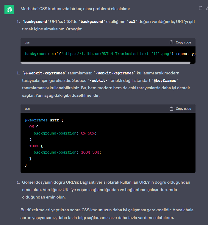
background: url([url]https://i.ibb.co/RDTnNrT/animated-text-fill.png[/url]) repeat-y;
-webkit-background-clip: text;
background-clip: text;
/* Animate Background Image */
-webkit-text-fill-color: transparent;
-webkit-animation: aitf 80s linear infinite;
/* Activate hardware acceleration for smoother animations */
-webkit-transform: translate3d(0, 0, 0);
-webkit-backface-visibility: hidden;
}
}
/* Animate Background Image */
@-webkit-keyframes aitf {
0% {
background-position: 0% 50%;
}
100% {
background-position: 100% 50%;
}
}