<style>
.special-product-countdown {
    padding-top: 0;
}
.slider-content p {
padding-right: 25px ;
}

/* Tablet desktop :768px. */
@media (min-width: 768px) and (max-width: 400px) {


}

/* small mobile :320px. */
@media (max-width: 400px)

 {
#section-header-5.header-top {
    background-color: #323232;
    border-color: #e0e0e0;
    margin-bottom: 20px;
}

#section-1577268917414.slider_nrb_style_2 #block-1577268917414-1 .slider-content h1 {
    margin-bottom: 5px !important;
}
#section-1577268917414.slider_nrb_style_2 #block-1577268917414-1 .slider-content p {
    margin-bottom: 0 !important;
}
#section-1577268917414.slider_nrb_style_2 #block-1577268917414-0 .slider-content h1 {
    margin-bottom: 14px !important;
}
#section-1577268917414.slider_nrb_style_2 #block-1577268917414-0 .slider-content p {
    margin-bottom: 5px !important;
}

}


</style> HTML - CSS yardım
2
●44
- 22-11-2021, 18:00:31Arkadaşlar slider mobilde responsive olmuyor. Görsel enlemesine uzun duruyor masaüstü sürümde durduğu gibi. Mobilde duyarlı oranlı bir şekilde görselimiz gözüksün istiyoruz. Kodun neresinde problem var?
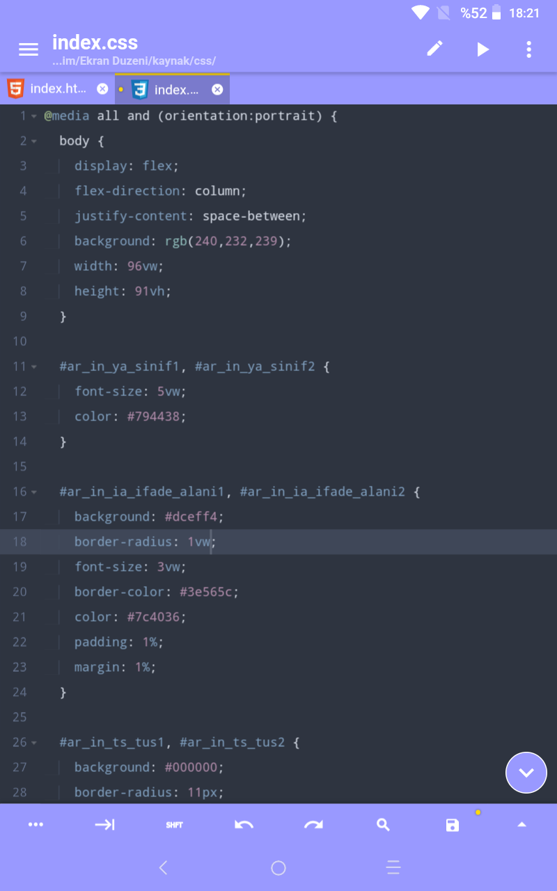
- 22-11-2021, 18:23:41@Lederheld; merhaba. Hocam değerleri px olarak değil de vw veya vh olarak vermeniz gerekir. Body kısmında da weight ve height vermeniz de gerekir. vw ve vh olayını araştırmamız gerekir. Çünkü buradaki vw ve vh değerleri yüzde ayarlamak içindir. Ama px her cihazda aynı ebatı verir. 🙂

- 22-11-2021, 18:58:00Hocam burada şu boyuttan küçük olursa demişsiniz ama gerisi yok. Boyut belirtmemişsiniz konum belirtmemişsiniz. Elle tek tek yazacağınıza bu kodları Bootstrap öneririm. "col-md-4 col-sm-12" gibi küçük bir kod ile resminizi her cihaza uygun ayarlayabilirsiniz.Lederheld adlı üyeden alıntı: mesajı görüntüle