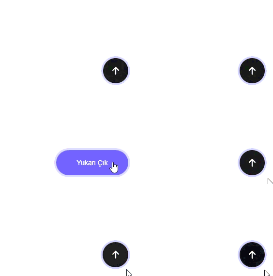
İhtiyacı olan alıp direkt projeye gömebilir.
Hazır ve temiz bir çözüm isteyenler için birebir. 🚀
Html
<button class="to-top-btn">
  <svg viewBox="0 0 384 512" class="to-top-icon">
    <path
      d="M214.6 41.4c-12.5-12.5-32.8-12.5-45.3 0l-160 160c-12.5 12.5-12.5 32.8 0 45.3s32.8 12.5 45.3 0L160 141.2V448c0 17.7 14.3 32 32 32s32-14.3 32-32V141.2L329.4 246.6c12.5 12.5 32.8 12.5 45.3 0s12.5-32.8 0-45.3l-160-160z"></path>
  </svg>
</button>Css.to-top-btn {
width: 52px;
height: 52px;
border-radius: 50%;
background-color: #1f1f1f;
border: none;
display: flex;
align-items: center;
justify-content: center;
box-shadow: 0 0 0 4px rgba(120, 100, 255, 0.25);
cursor: pointer;
overflow: hidden;
position: fixed;
right: 20px;
bottom: 20px;
transition: all 0.3s ease;
}
.to-top-icon {
width: 14px;
transition: transform 0.3s ease;
}
.to-top-icon path {
fill: white;
}
.to-top-btn:hover {
width: 150px;
border-radius: 40px;
background-color: #7c6cff;
transition: all 0.3s ease;
}
.to-top-btn:hover .to-top-icon {
transform: translateY(-200%);
}
.to-top-btn::before {
position: absolute;
bottom: -20px;
content: "Yukarı Çık";
color: white;
font-size: 0px;
transition: font-size 0.3s ease, bottom 0.3s ease;
}
.to-top-btn:hover::before {
font-size: 14px;
bottom: unset;
}Çıktı: