

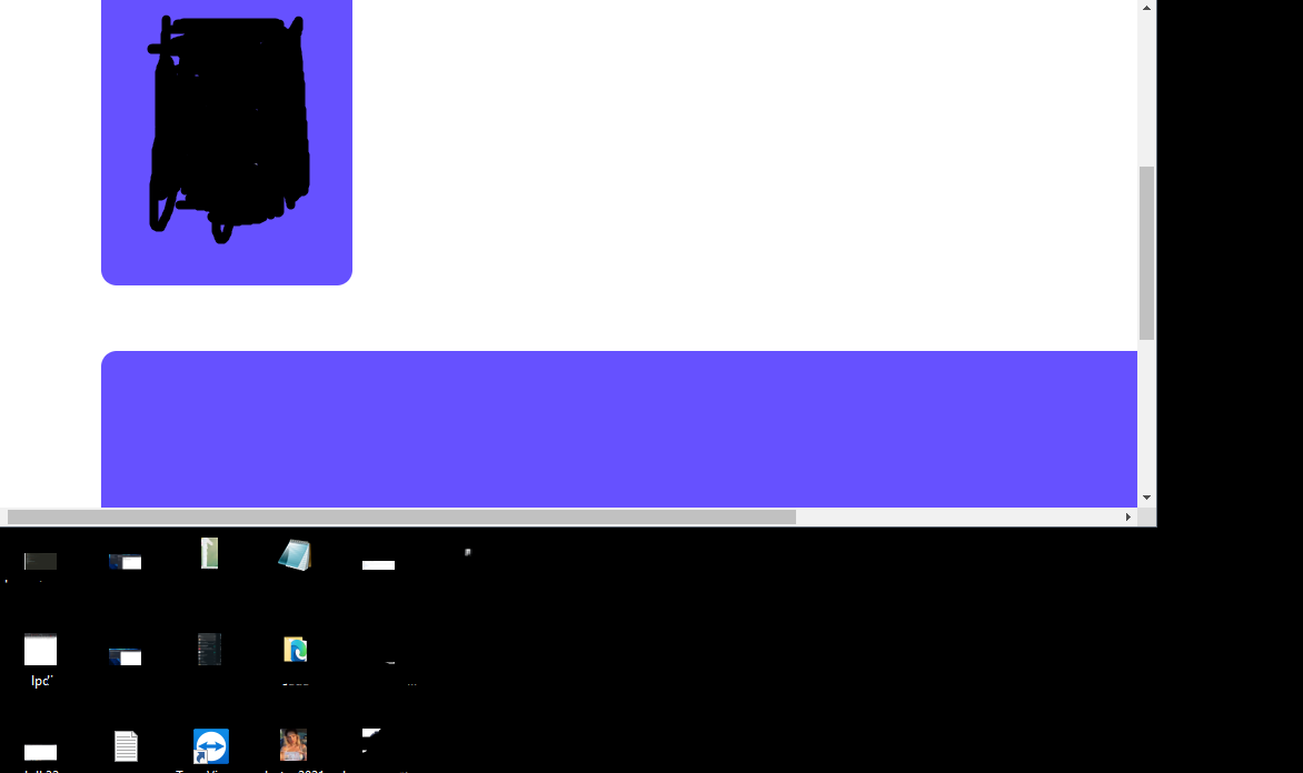
ekranı küçülttüğümde bu şekilde gözüküyor büyük olan divin ekran boyuna göre uzamasını nasıl sağlarım ?
12
●106
  .profile2{
   min-width: 60%;
   width: auto;
   float: left;
  margin-top: 5%;
  background-color: #6651FF;
  margin-left: 5px;
  min-height: 590px;
  height: auto;
  border: 5px solid white;
  border-radius: 20px;
  margin-left: 100px;
  }
@media only screen and (max-width: 768px) {
  [class*="profile2"] {
     margin-top: 15px;

     width: 100%;

     margin-left: 1px;
     margin-right: 1px;

} 
<head>
<style>
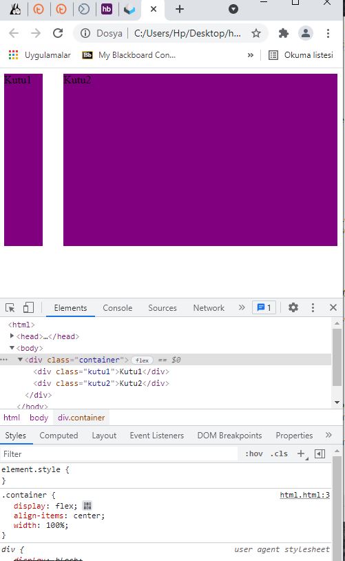
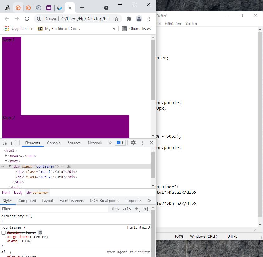
.container {
display:flex;
align-items:center;
width:100%;
}
.kutu1{
width:60px;
height:250px;
background-color:purple;
margin-right:30px;
}
.kutu2{
width:calc(100% - 60px);
height:250px;
background-color:purple;
}
</style>
<body>
<div class="container">
<div class="kutu1">Kutu1</div>
<div class="kutu2">Kutu2</div>
</div>
</body>
</head> .profile2{
min-width: 60%;
width: auto;
float: left;
margin-top: 5%;
background-color: #6651FF;
margin-left: 5px;
min-height: 590px;
height: auto;
border: 5px solid white;
border-radius: 20px;
margin-left: 100px;
}
@media only screen and (max-width: 768px) {
[class*="profile2"] {
margin-top: 15px;
width: 100%;
margin-left: 1px;
margin-right: 1px;
}
.profile{
float: left;
margin-top: 5%;
background-color: #6651FF;
margin-left: 5px;
width: 250px;
height: 590px;
border: 5px solid white;
border-radius: 20px;
margin-left: 100px;
}
@media only screen and (max-width: 768px) {
[class*="profile"] {
margin-top: 15px;
width: 100%;
margin-left: 1px;
margin-right: 1px;
} 
