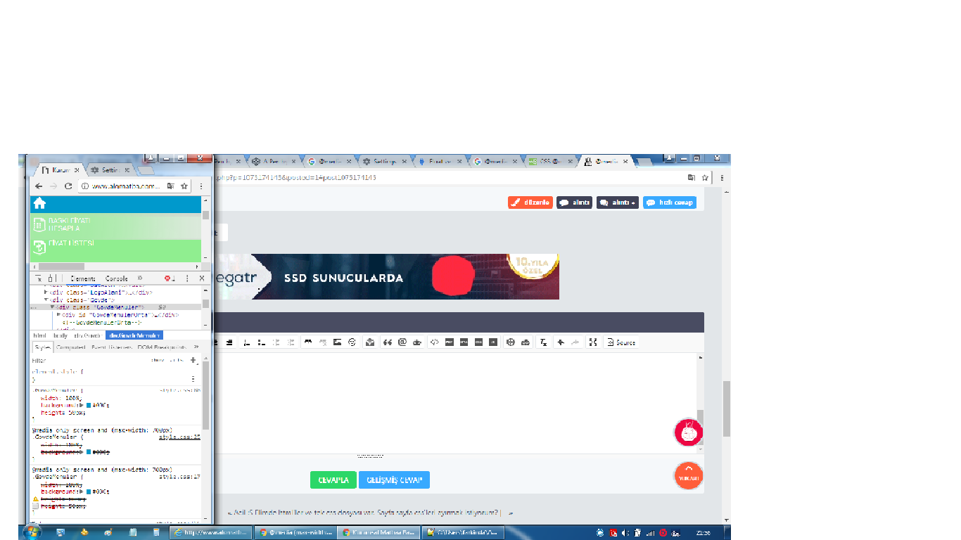
@media only screen and (max-width: 700px) { böyle çözüldü.
bir sorun daha var. HEİGHT: 50 PX bunu nasıl MEDİA içinde iptal ederim

[...sim.com/D7dkny)
@media only screen and (max-width: 700px) {/*screen and */

    #GovdeMenulerOrta ul li {
            float: none;
            width: 100%; height: ;
    }
     .GovdeMenuler {
    width: 100%;
    background: #09C; height: ;
}
    body {  background-color: lightgreen;   }
        .LogoAlani{ width:600px; border:2px solid black;}
        .aramaBolumu{display:none;}
        .GovdeMenuler{ width: 100%; background: #09C;}
}